
STAY
A POSTER SERIES EXPLORING INTERSTELLAR THROUGH HAND-PAINTED ACRYLIC TEXTURE, LETTER BY LETTER.
Client
Academic Project (Conceptual)
Services
Poster Design
PROJECT OVERVIEW
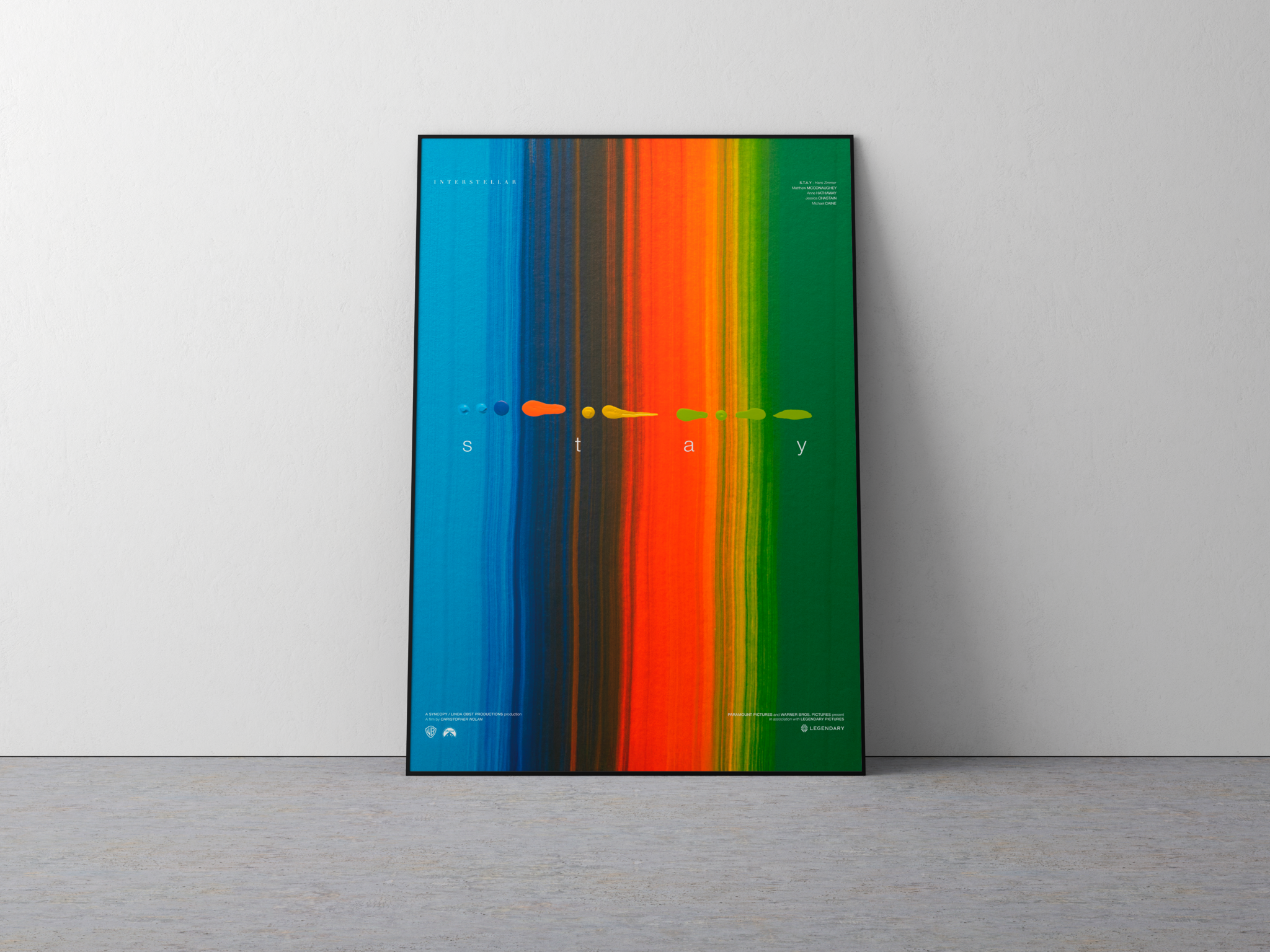
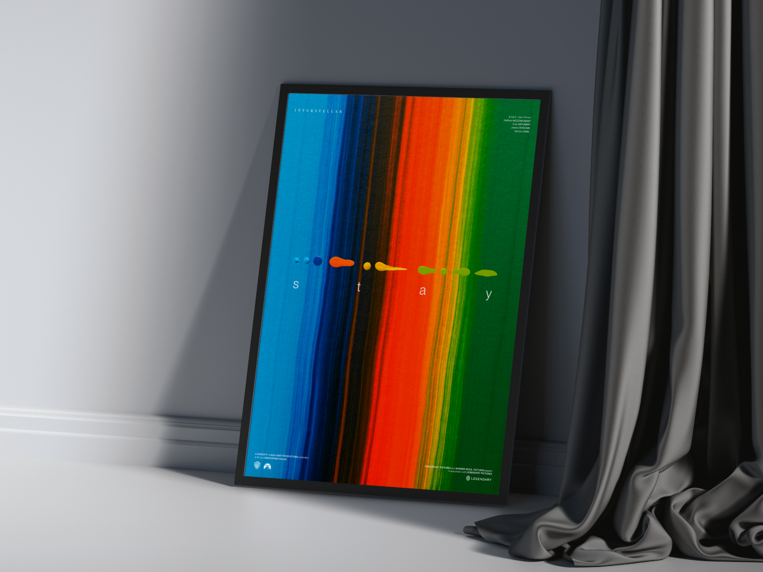
This series takes a single word — stay — and lets it carry the weight of the film's emotional core across three posters. Before any layout existed, the real work happened on canvas: acrylic paint pushed, dragged, and layered by hand until it produced color fields that felt closer to gravity and time than to design software. The task wasn't to illustrate the film, but to translate its feeling into texture first, typography second.
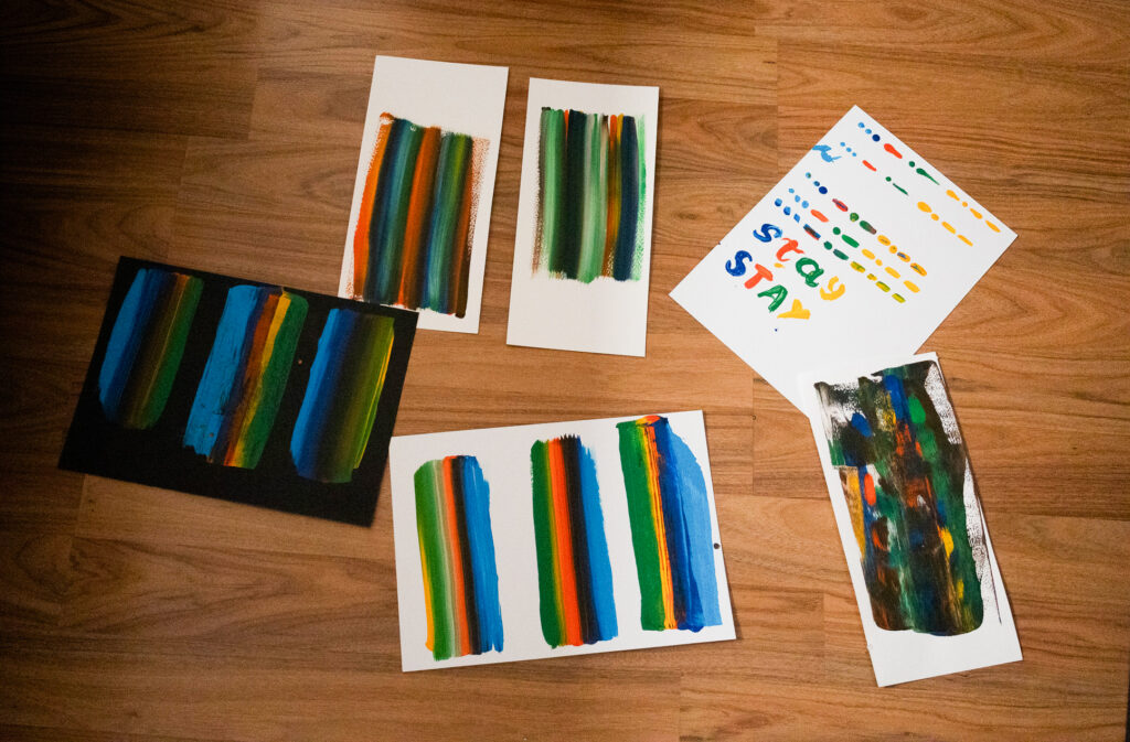
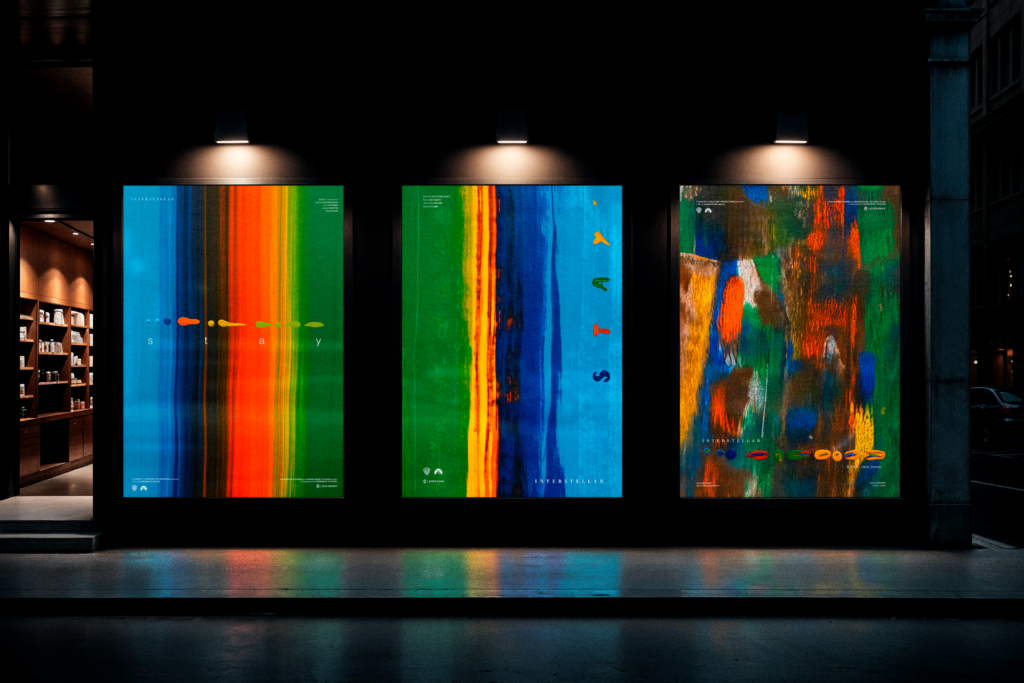
Every gradient, every bleed of orange into blue, started as a physical brushstroke — nothing was built with digital blending tools. That constraint shaped the whole series: three canvases, three separate paintings, each dictating its own palette before a single letter was placed on top. The typography had to adapt to the paint, never the other way around.
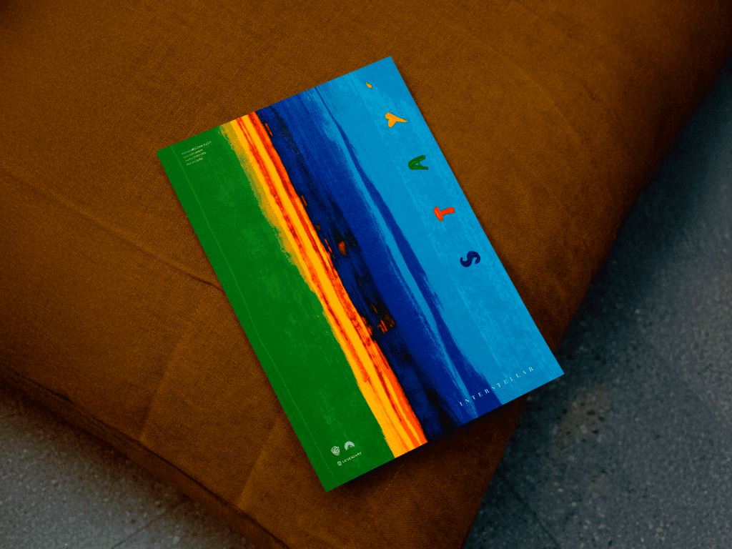
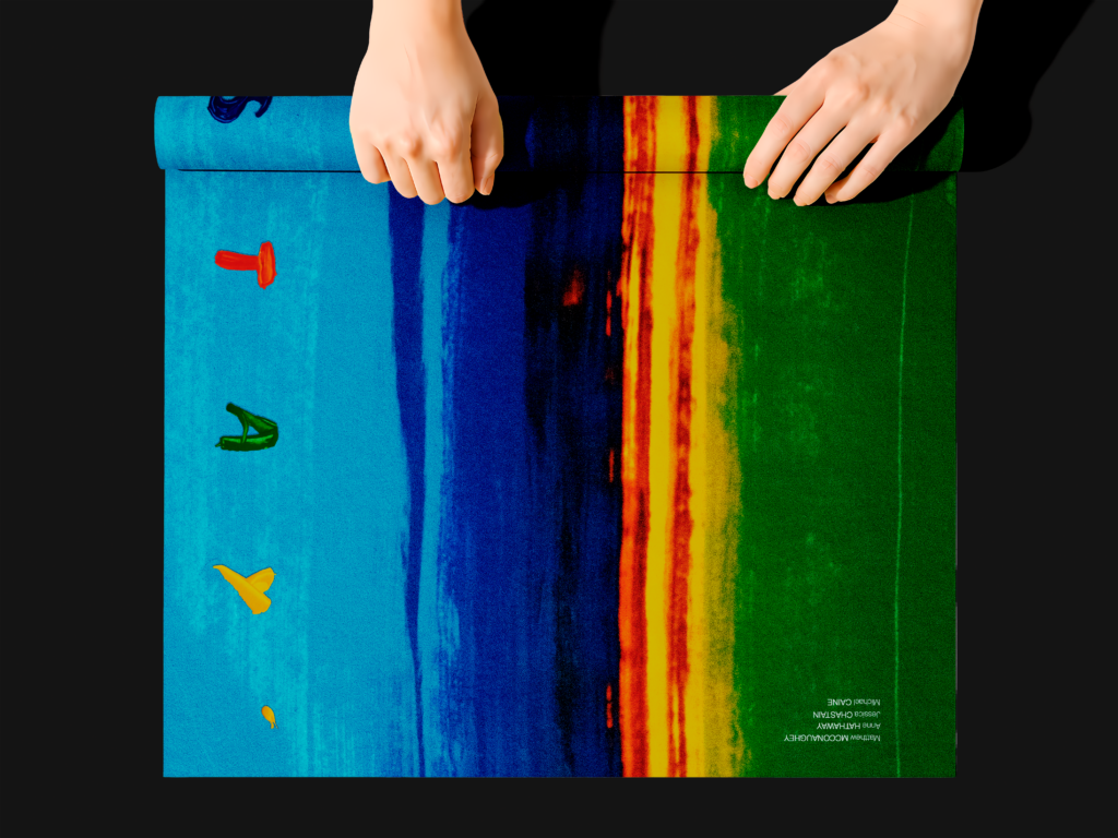
Getting there meant treating the acrylic as the primary decision and the layout as the response to it. A color shift that looked accidental on canvas became the reason a letter sat where it did — the texture wrote the rules, the type just followed them.
THE COLOR EXISTED BEFORE THE WORD DID
The digital work stayed deliberately minimal: scanning and color-correcting each painted sheet to preserve its true pigment, then placing a single word — S, T, A, Y — split one letter per poster, so the phrase only completes when all three hang together. Everything else, from the wash of green to the streak of orange, is unedited paint.
In the end, the posters aren't meant to look painted — they're meant to look inevitable, as if that exact color had always been waiting for that exact letter.
THREE CANVASES, ONE WORD, HELD TOGETHER BY NOTHING BUT COLOR THAT WAS NEVER MEANT TO MATCH — UNTIL IT DID.
THIS PROJECT IS A CONCEPTUAL ACADEMIC EXERCISE INSPIRED BY THE FILM INTERSTELLAR. IT IS NOT AFFILIATED WITH, ENDORSED BY, OR CREATED FOR COMMERCIAL GAIN IN ASSOCIATION WITH WARNER BROS., LEGENDARY PICTURES, PARAMOUNT, OR ANY RIGHTS HOLDERS OF INTERSTELLAR.
STAY
A POSTER SERIES EXPLORING INTERSTELLAR THROUGH HAND-PAINTED ACRYLIC TEXTURE, LETTER BY LETTER.
Client
Academic Project (Conceptual)
Services
Poster Design
PROJECT OVERVIEW
This series takes a single word — stay — and lets it carry the weight of the film's emotional core across three posters. Before any layout existed, the real work happened on canvas: acrylic paint pushed, dragged, and layered by hand until it produced color fields that felt closer to gravity and time than to design software. The task wasn't to illustrate the film, but to translate its feeling into texture first, typography second.
Every gradient, every bleed of orange into blue, started as a physical brushstroke — nothing was built with digital blending tools. That constraint shaped the whole series: three canvases, three separate paintings, each dictating its own palette before a single letter was placed on top. The typography had to adapt to the paint, never the other way around.
Getting there meant treating the acrylic as the primary decision and the layout as the response to it. A color shift that looked accidental on canvas became the reason a letter sat where it did — the texture wrote the rules, the type just followed them.
THE COLOR EXISTED BEFORE THE WORD DID
The digital work stayed deliberately minimal: scanning and color-correcting each painted sheet to preserve its true pigment, then placing a single word — S, T, A, Y — split one letter per poster, so the phrase only completes when all three hang together. Everything else, from the wash of green to the streak of orange, is unedited paint.
In the end, the posters aren't meant to look painted — they're meant to look inevitable, as if that exact color had always been waiting for that exact letter.