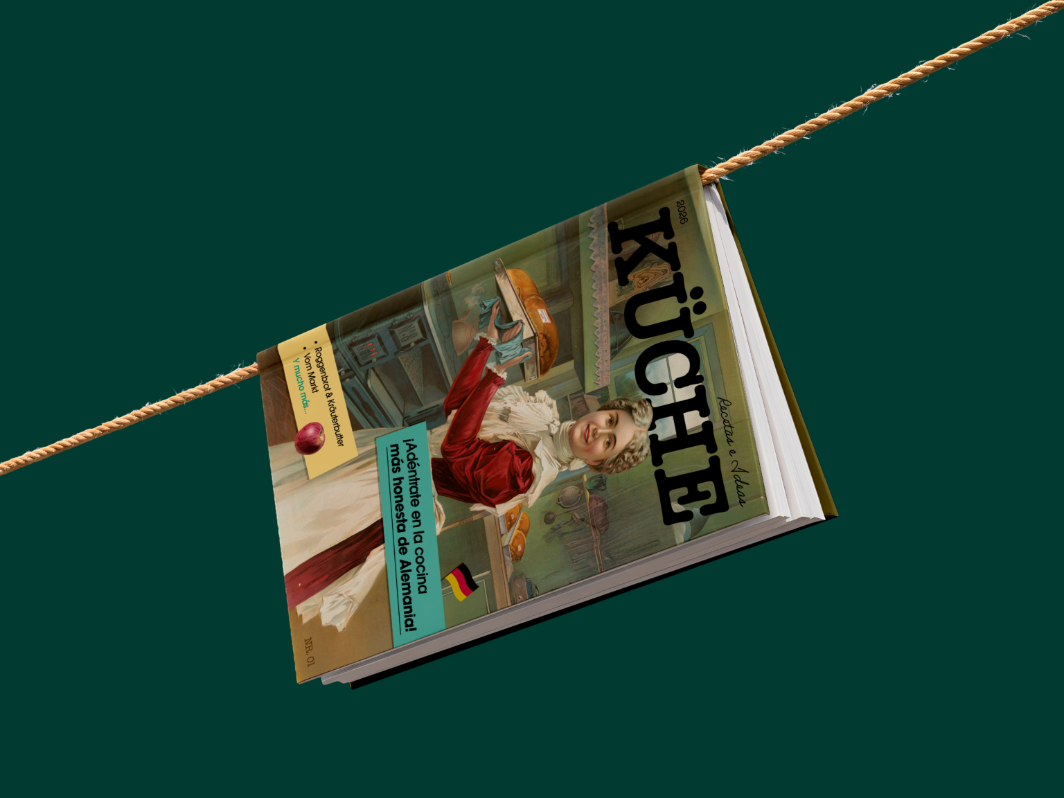
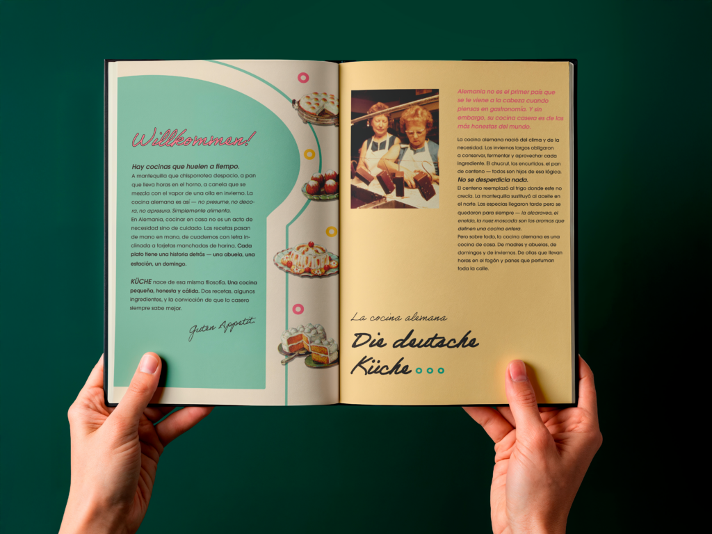
Küche
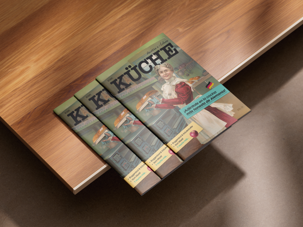
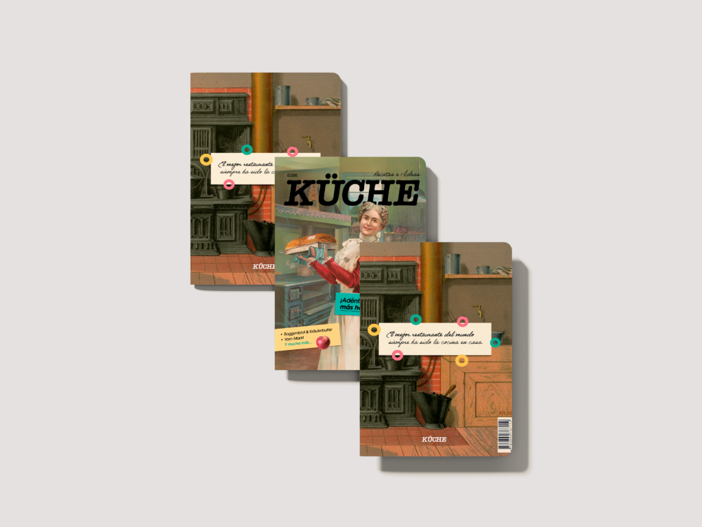
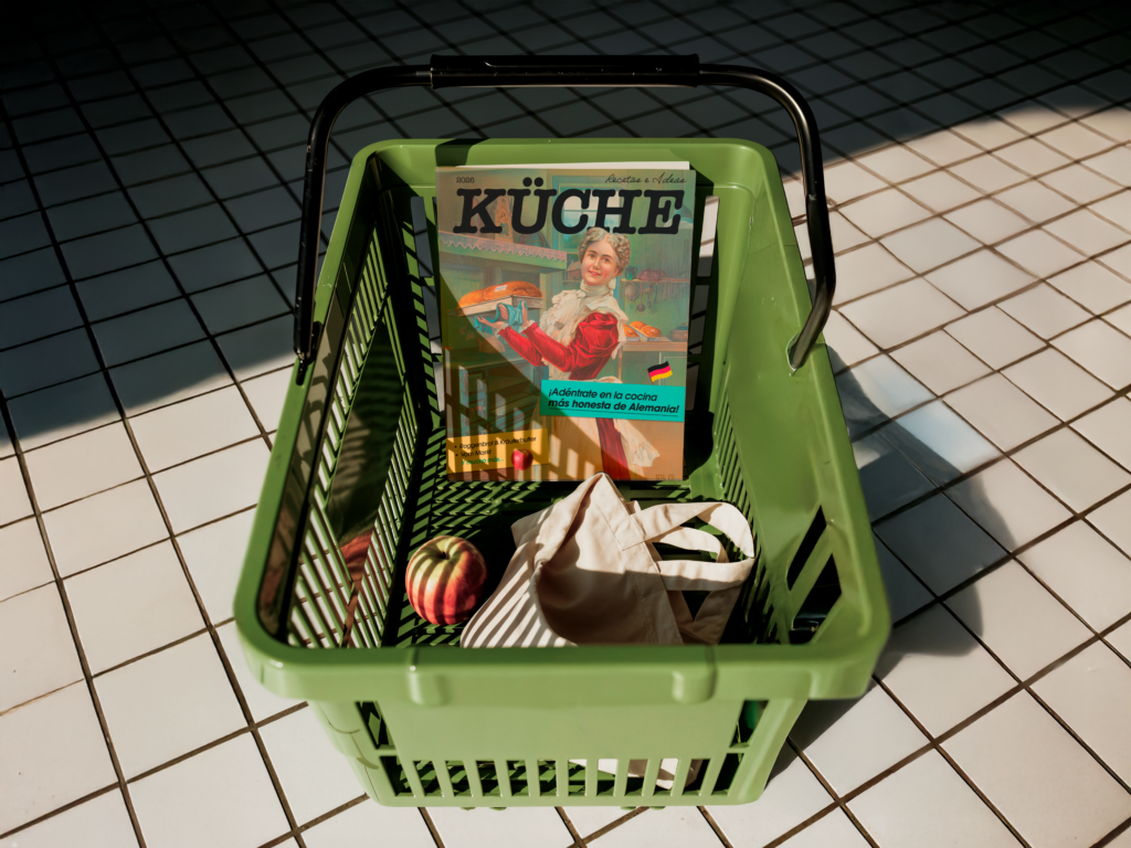
AN EDITORIAL MAGAZINE RECLAIMING GERMAN HOME COOKING, BALANCING TRADITION AND WARMTH WITH A CONTEMPORARY VISUAL SYSTEM.
Client
Self-Initiated Project
Services
Editorial Design
ARTIFACTS
THE CULTURAL FRAGMENTS, REFERENCES, AND INGREDIENTS THAT SHAPE THE SOUL OF THIS PROJECT.
BREAD AS IDENTITY
Not decorative, not fluffy — dense, dark, and full of history.
SWEETNESS WITHOUT EXCESS
German sweetness doesn't aim to impress — it aims to accompany.
PANTRY PALETTE
The colors of a cupboard, not a trend.
WHAT IF GERMAN COOKING DIDN'T HAVE TO APOLOGIZE FOR BEING SIMPLE?
German cooking carries a reputation it doesn't deserve — cold, purely functional, without soul. But behind that reputation are pots that simmer for hours, loaves that perfume an entire street, and recipes passed hand to hand without needing outside validation. Here, the work isn't only in what's seen — it's in what's felt while cooking slowly.
Archetypes
ENDURING PERSONAS THAT GUIDE A BRAND'S SPIRIT AND PRESENCE.
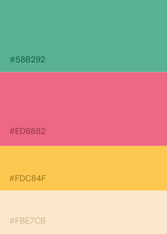
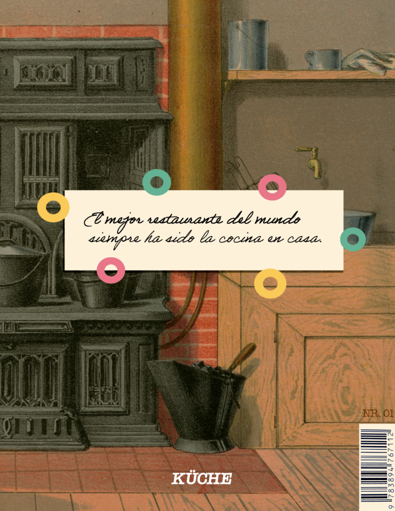
The brand sits between the caregiver and the everyman — care and honesty in equal parts. This mirrored the brand strategy precisely: tradition and warmth.
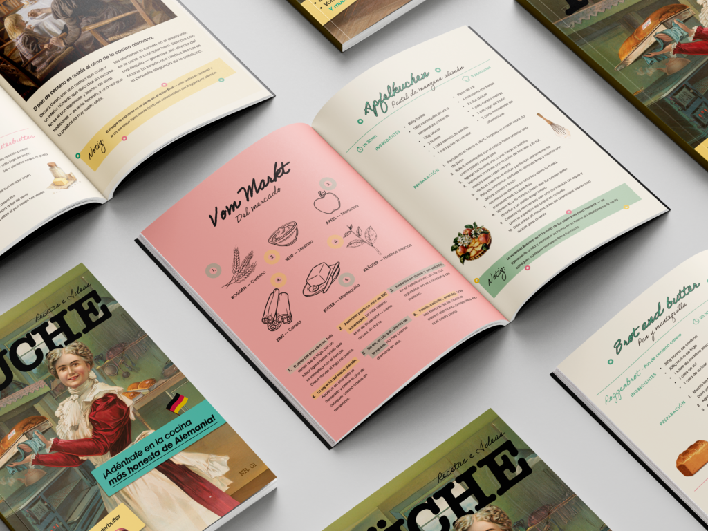
Color came first. The pantry palette — flour, butter, cinnamon, rye — became the foundation. It let the brand speak to the homemade without falling into rustic cliché. Next came the typographic system: ITC Souvenir Bold for warmth, Helvetica Condensed Bold for precision, designed to coexist without competing.
Photography and texture followed. The crust of a loaf, the skin of an apple, freshly whipped butter — the team looked to the kitchen itself instead of relying solely on stock photography. This visual system, born from strategy, carried a calm confidence. The brand wasn't just cohesive, it was obvious in the best way. So considered, it could only belong to this kitchen and the stories that already lived in it.
Küche
AN EDITORIAL MAGAZINE RECLAIMING GERMAN HOME COOKING, BALANCING TRADITION AND WARMTH WITH A CONTEMPORARY VISUAL SYSTEM.
Client
Self-Initiated Project
Services
Editorial Design
ARTIFACTS
THE CULTURAL FRAGMENTS, REFERENCES, AND INGREDIENTS THAT SHAPE THE SOUL OF THIS PROJECT.
BREAD AS IDENTITY
Not decorative, not fluffy — dense, dark, and full of history.
SWEETNESS WITHOUT EXCESS
German sweetness doesn't aim to impress — it aims to accompany.
PANTRY PALETTE
The colors of a cupboard, not a trend.
WHAT IF GERMAN COOKING DIDN'T HAVE TO APOLOGIZE FOR BEING SIMPLE?
German cooking carries a reputation it doesn't deserve — cold, purely functional, without soul. But behind that reputation are pots that simmer for hours, loaves that perfume an entire street, and recipes passed hand to hand without needing outside validation. Here, the work isn't only in what's seen — it's in what's felt while cooking slowly.
Archetypes
ENDURING PERSONAS THAT GUIDE A BRAND'S SPIRIT AND PRESENCE.
The brand sits between the caregiver and the everyman — care and honesty in equal parts. This mirrored the brand strategy precisely: tradition and warmth.
Color came first. The pantry palette — flour, butter, cinnamon, rye — became the foundation. It let the brand speak to the homemade without falling into rustic cliché. Next came the typographic system: ITC Souvenir Bold for warmth, Helvetica Condensed Bold for precision, designed to coexist without competing.
Photography and texture followed. The crust of a loaf, the skin of an apple, freshly whipped butter — the team looked to the kitchen itself instead of relying solely on stock photography. This visual system, born from strategy, carried a calm confidence. The brand wasn't just cohesive, it was obvious in the best way. So considered, it could only belong to this kitchen and the stories that already lived in it.