BRANDON GROTESQUE
A THREE-POSTER SERIES WHERE THE TYPEFACE ISN'T USED TO SAY SOMETHING — IT IS THE SOMETHING BEING SAID.
Client
Academic Project (Conceptual)
Services
Poster Design
PROJECT OVERVIEW
This series has no product, no story, no brand to sell — only a typeface to introduce. Brandon Grotesque, the geometric sans serif designed by Hannes von Döhren in 2010, becomes both subject and material: every poster is built entirely from its own letterforms, with nothing borrowed from outside the font itself. The task was to make a typeface legible not just as text, but as image — something worth stopping for on a bus shelter or a shuttered storefront.

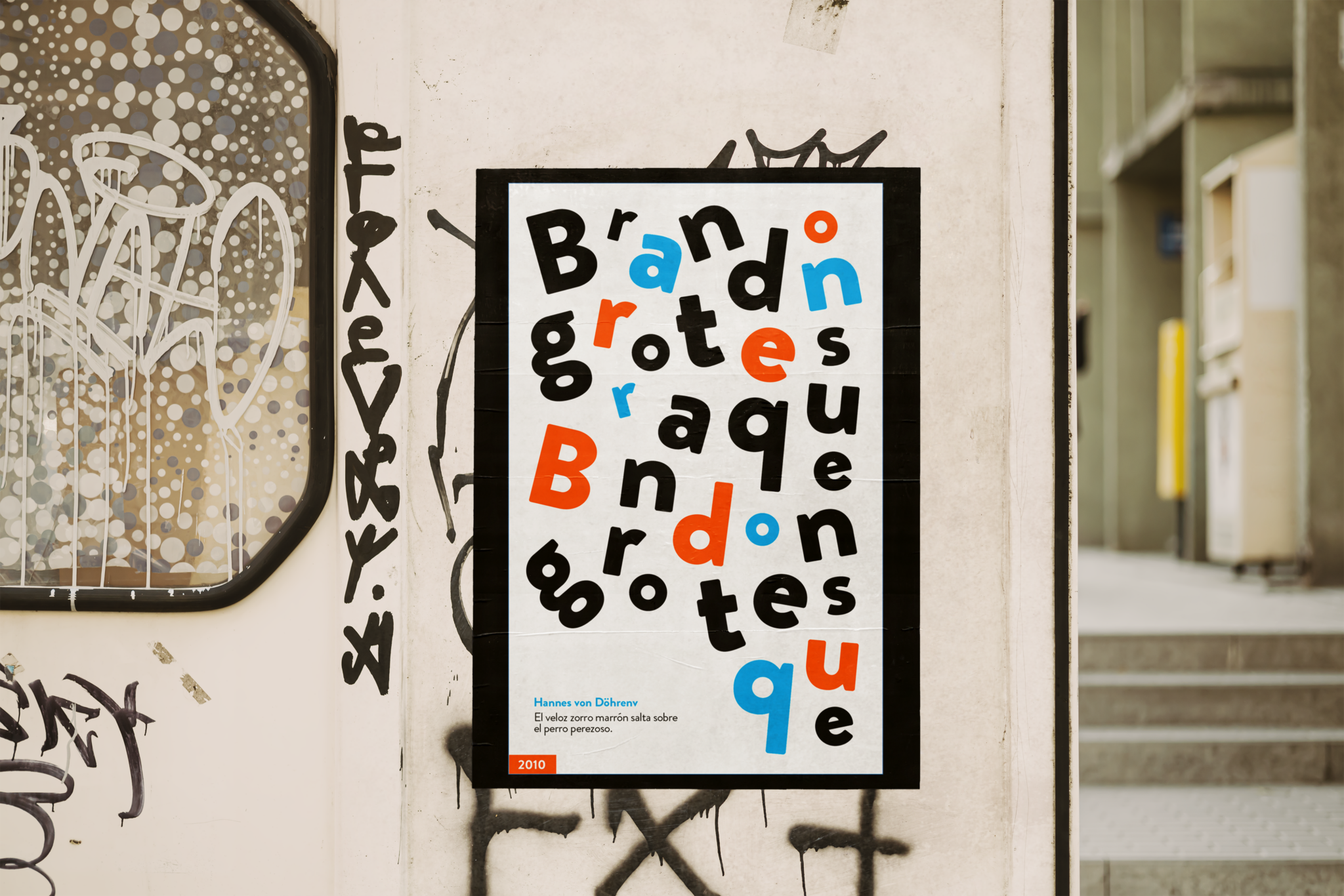
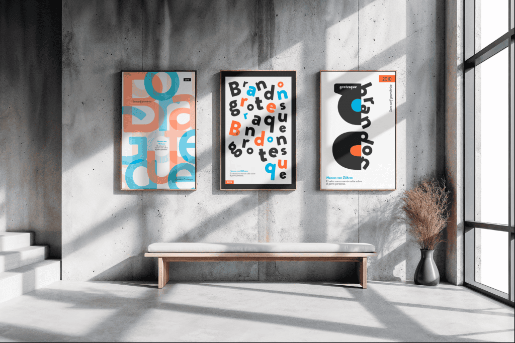
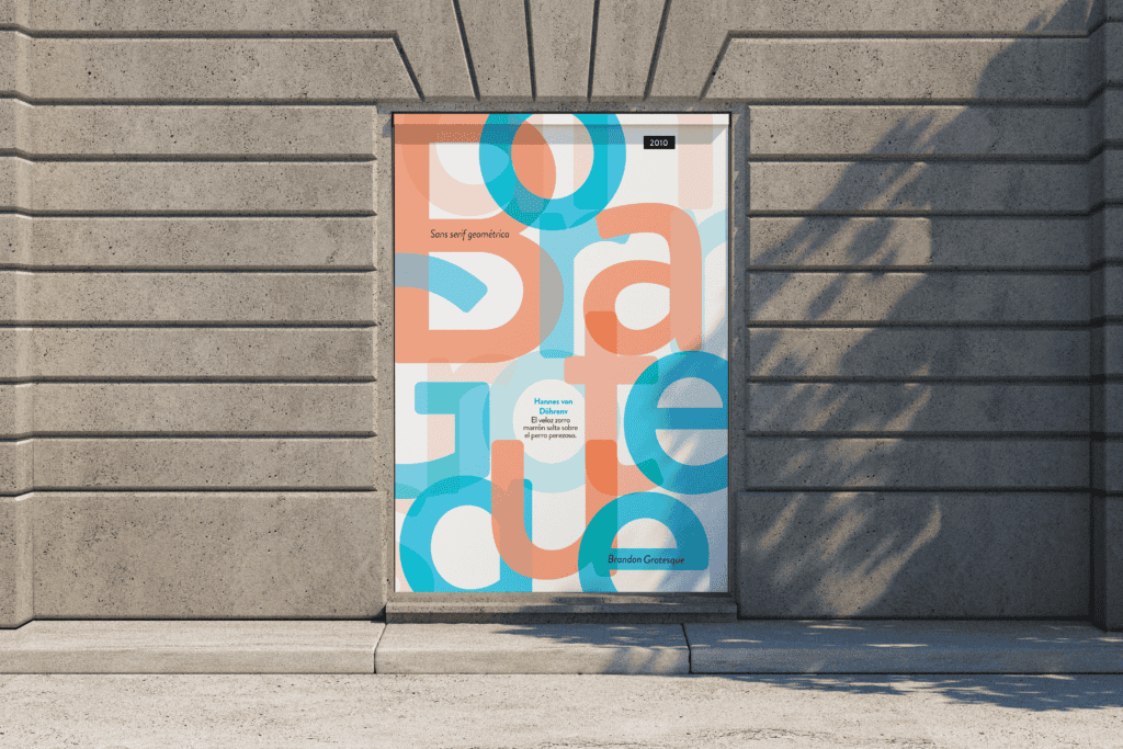
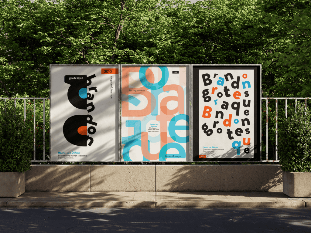
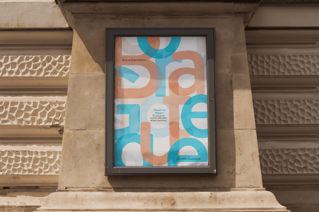
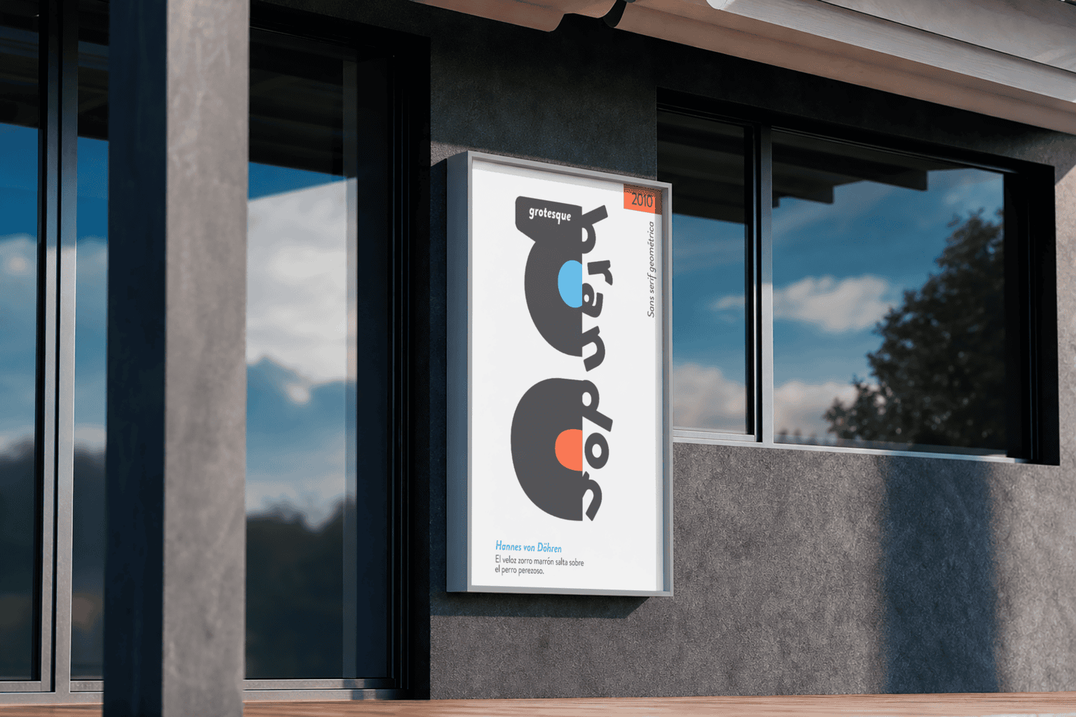
Each poster takes a different stance on the same letters. The first mirrors and halves the word itself, letting negative space do as much work as ink. The second scatters individual characters until they read as rhythm before they read as language. The third layers translucent forms until color, not shape, becomes the way the eye finds the word. Three arguments, one typeface, no other tools allowed.
Getting there meant treating restraint as the whole design problem. No illustration, no photography, no secondary typeface — just Brandon Grotesque, pushed until it could carry a poster on its own.
THE TYPEFACE WAS THE ONLY BRIEF
The mockups place each poster in a different real-world context — a bus stop, a rusted roll-up shutter, a fence line — to test the same question three times: does the type still hold up outside a clean studio frame, against weather, shadow, and street noise? The credit line stays constant across every poster: Hannes von Döhren, 2010, sans serif geométrica.
In the end, the posters aren't meant to advertise anything — they're meant to make someone read a typeface's name the way they'd read a headline.
NOT A CAMPAIGN FOR A PRODUCT — A CAMPAIGN FOR A LETTERFORM, ARGUING ITS OWN CASE THREE DIFFERENT WAYS.
THIS PROJECT IS A CONCEPTUAL ACADEMIC EXERCISE CREATED TO SHOWCASE THE BRANDON GROTESQUE TYPEFACE, DESIGNED BY HANNES VON DÖHREN (HVD FONTS, 2010). IT IS NOT AFFILIATED WITH, ENDORSED BY, OR CREATED FOR COMMERCIAL GAIN IN ASSOCIATION WITH HVD FONTS OR HANNES VON DÖHREN.
BRANDON GROTESQUE
A THREE-POSTER SERIES WHERE THE TYPEFACE ISN'T USED TO SAY SOMETHING — IT IS THE SOMETHING BEING SAID.
Client
Academic Project (Conceptual)
Services
Poster Design
PROJECT OVERVIEW
This series has no product, no story, no brand to sell — only a typeface to introduce. Brandon Grotesque, the geometric sans serif designed by Hannes von Döhren in 2010, becomes both subject and material: every poster is built entirely from its own letterforms, with nothing borrowed from outside the font itself. The task was to make a typeface legible not just as text, but as image — something worth stopping for on a bus shelter or a shuttered storefront.
Each poster takes a different stance on the same letters. The first mirrors and halves the word itself, letting negative space do as much work as ink. The second scatters individual characters until they read as rhythm before they read as language. The third layers translucent forms until color, not shape, becomes the way the eye finds the word. Three arguments, one typeface, no other tools allowed.
Getting there meant treating restraint as the whole design problem. No illustration, no photography, no secondary typeface — just Brandon Grotesque, pushed until it could carry a poster on its own.
THE TYPEFACE WAS THE ONLY BRIEF
The mockups place each poster in a different real-world context — a bus stop, a rusted roll-up shutter, a fence line — to test the same question three times: does the type still hold up outside a clean studio frame, against weather, shadow, and street noise? The credit line stays constant across every poster: Hannes von Döhren, 2010, sans serif geométrica.
In the end, the posters aren't meant to advertise anything — they're meant to make someone read a typeface's name the way they'd read a headline.