EMPIRE
COOKIES

A New York-inspired cookie brand rebuilt from the ground up. Bold identity, urban soul.

Client

Empire Cookies

Services

Brand Identity
Logo Redesign

PROJECT OVERVIEW

Empire Cookies came with an existing logo that had lost its way — competing elements, inconsistent typography, a decorative cookie icon that weakened scalability, and a circular border that limited its application across formats. The challenge was clear: strip it back, find the brand's real character, and rebuild it with intention.

The original mark tried to say too much. A mix of typefaces, a functional icon placed at the center disrupting readability, and a contained circular shape made the logo difficult to apply at different scales. It lacked the confidence a brand rooted in New York deserved.

EMPIRE COOKIES NEEDED A MARK AS BOLD AS THE CITY IT CARRIES IN ITS NAME.

THE GRID

Every curve in the script was built on intention. The logo construction grid defines the spatial relationships between Empire and Cookies — establishing clear zones of protection, alignment anchors, and proportion rules that keep the mark consistent whether it lives on a cookie sleeve, a sticker, or a storefront.

THE ICONS

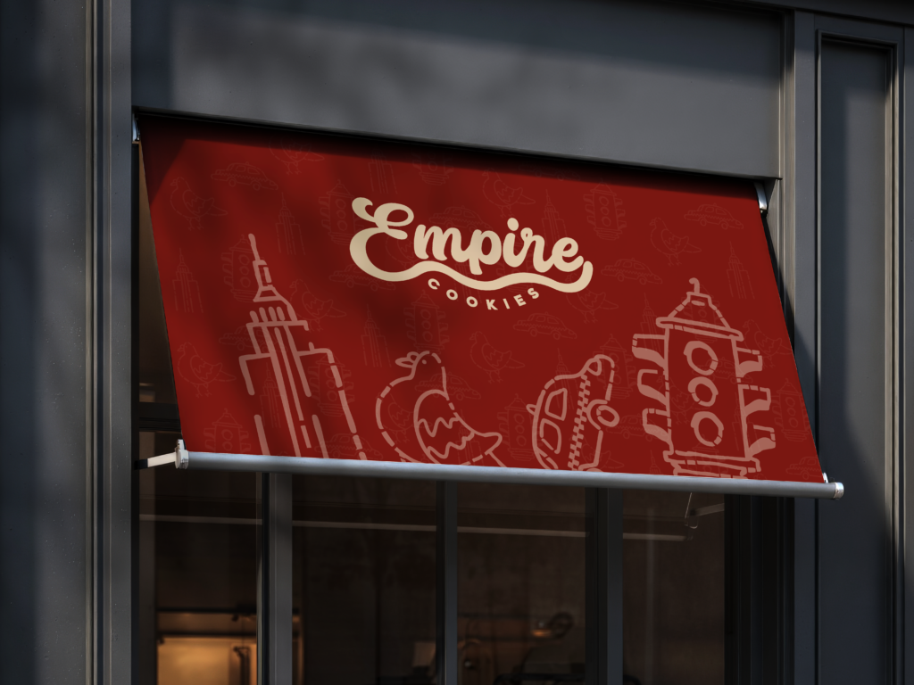
Four icons. Four corners of New York. The Empire State, the city pigeon, the yellow cab, the street light — each drawn by hand with an organic, imperfect line that keeps the brand approachable. Used as packaging ornaments, sticker elements, or standalone marks, they extend the identity beyond the logo into a full visual language.

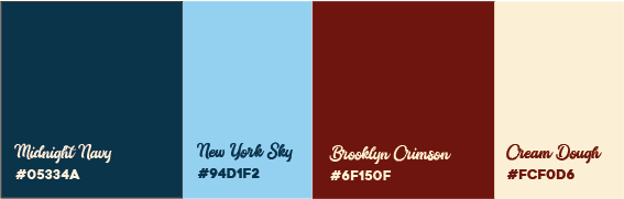
A COLOR SYSTEM ROOTED IN THE CITY AND THE CRAFT.

Empire Cookies launched with a brand identity that finally matched the ambition behind the name. The redesign was approved by the client and put into immediate use across their business — from packaging to point of sale. What started as a logo problem became a full visual system: coherent, scalable, and built to grow with the brand.

EMPIRE
COOKIES

A New York-inspired cookie brand rebuilt from the ground up. Bold identity, urban soul.

Client

Empire Cookies

Services

Brand Identity
Logo Redesign

PROJECT OVERVIEW

Empire Cookies came with an existing logo that had lost its way — competing elements, inconsistent typography, a decorative cookie icon that weakened scalability, and a circular border that limited its application across formats. The challenge was clear: strip it back, find the brand's real character, and rebuild it with intention.

The original mark tried to say too much. A mix of typefaces, a functional icon placed at the center disrupting readability, and a contained circular shape made the logo difficult to apply at different scales. It lacked the confidence a brand rooted in New York deserved.

EMPIRE COOKIES NEEDED A MARK AS BOLD AS THE CITY IT CARRIES IN ITS NAME.

THE GRID

Every curve in the script was built on intention. The logo construction grid defines the spatial relationships between Empire and Cookies — establishing clear zones of protection, alignment anchors, and proportion rules that keep the mark consistent whether it lives on a cookie sleeve, a sticker, or a storefront.

THE ICONS

Four icons. Four corners of New York. The Empire State, the city pigeon, the yellow cab, the street light — each drawn by hand with an organic, imperfect line that keeps the brand approachable. Used as packaging ornaments, sticker elements, or standalone marks, they extend the identity beyond the logo into a full visual language.

A COLOR SYSTEM ROOTED IN THE CITY AND THE CRAFT.

Empire Cookies launched with a brand identity that finally matched the ambition behind the name. The redesign was approved by the client and put into immediate use across their business — from packaging to point of sale. What started as a logo problem became a full visual system: coherent, scalable, and built to grow with the brand.