A CHOCOLATE-COVERED UCHUVA SNACK ROOTED IN COLOMBIAN ABUNDANCE AND QUIET INDULGENCE.
Client
Academic Project (Conceptual)
Services
Packaging Design Branding
PROJECT OVERVIEW
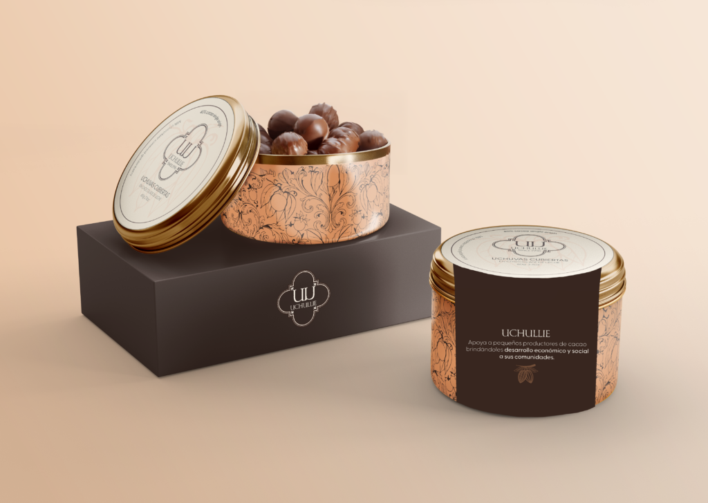
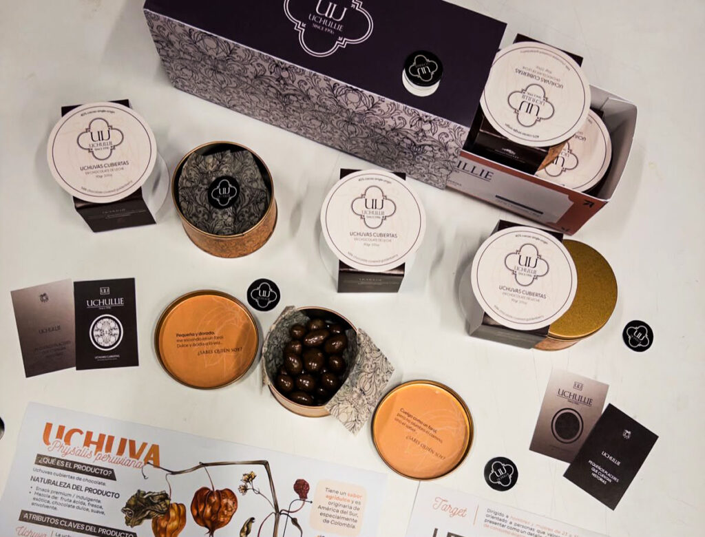
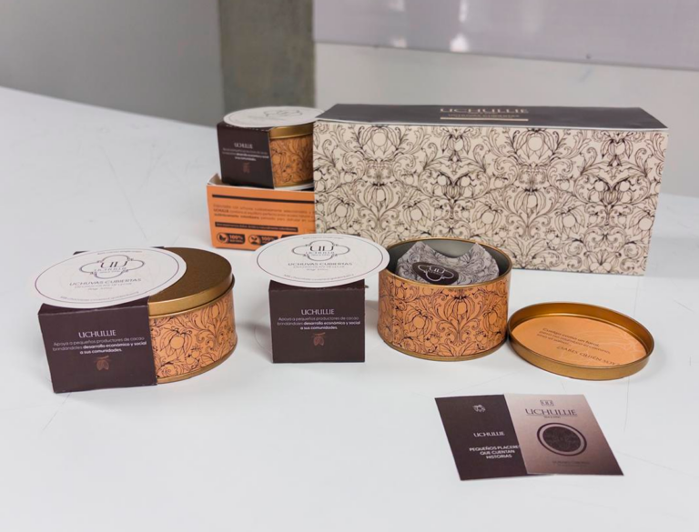
This project explores the design of a full packaging system for Uchullie, a premium confectionery brand built around a single native ingredient: the uchuva, wrapped in its own paper-thin husk. The goal was to translate an everyday, unassuming fruit into a cohesive visual identity across individual sleeves and outer packaging, balancing local heritage with a restrained, contemporary packaging language.
The name Uchullie already carried meaning. Built from "uchuva," the name keeps the fruit's identity intact while giving it a softer, more polished cadence — closer to something you'd find on a confectionery shelf than a farmers' market. A small linguistic gesture that mirrors what the packaging does visually: taking something familiar and elevating it without erasing where it comes from.
It was important to honor that origin without falling into the "exotic fruit" cliché. The tone became refined and minimal — rooted in the fruit's own form, not caricature. Visually, the system embraced restrained color, botanical linework, and a typographic hierarchy that let the lantern motif breathe on its own across sleeves while unifying the set as a whole.
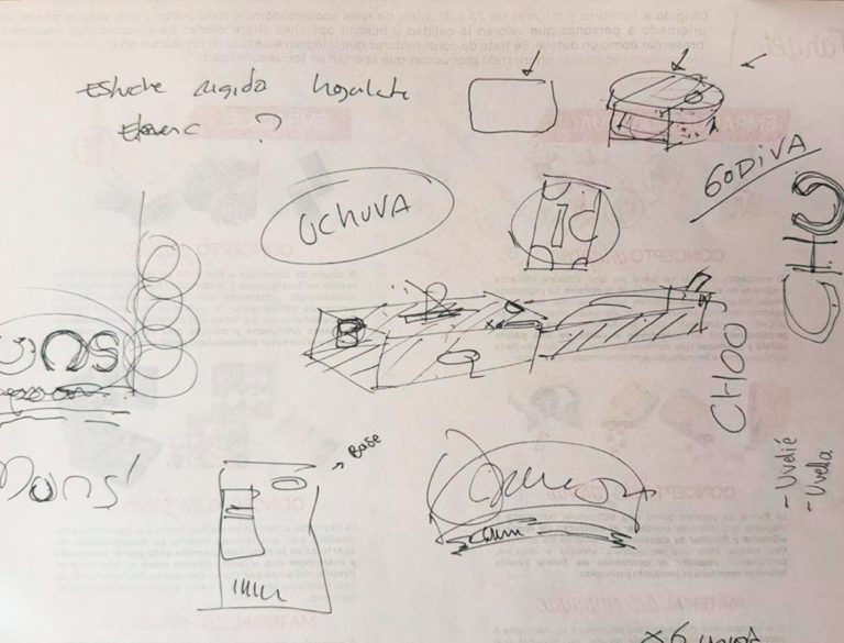
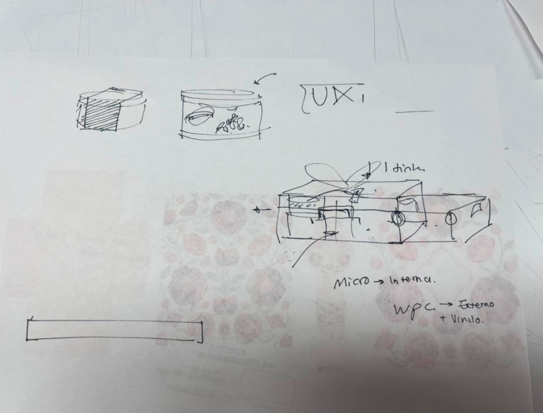
FROM SKETCH TO SLEEVE
Every mark on the label began on paper. Hand-drawn studies of pine needles, bamboo stalks, and plum blossoms guided the digital linework that followed—keeping each symbol true to its botanical roots before becoming part of the final system.
INK, COPPER, AND GOLD
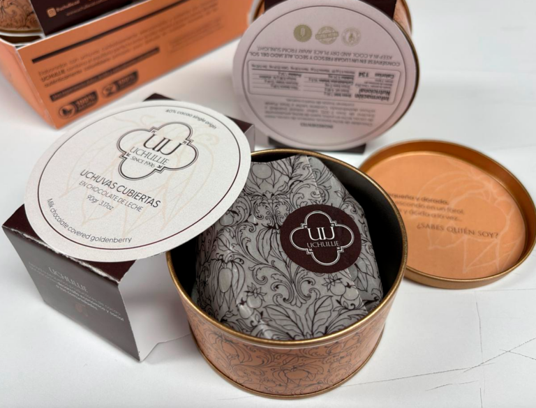
The wrapper takes its silhouette from the uchuva's own husk — the small, tapered lantern that already does the work of packaging in nature. That form became the starting point: a slim, foil-lined sleeve that tapers at both ends, echoing the fruit's silhouette without illustrating it literally. A twist-close finish turns the wrapper into a small ritual of its own — closer to unwrapping a gift than opening a snack.
EACH SHADE, A FRAGMENT OF THE FRUIT.
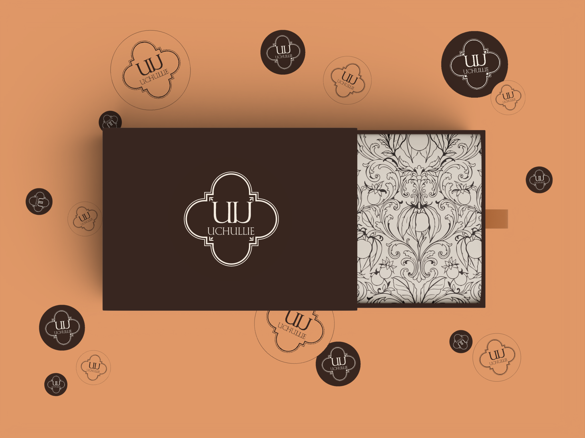
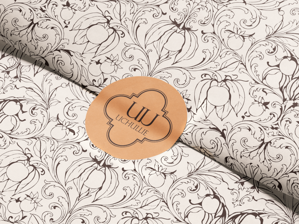
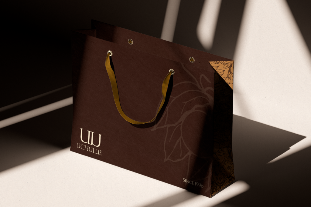
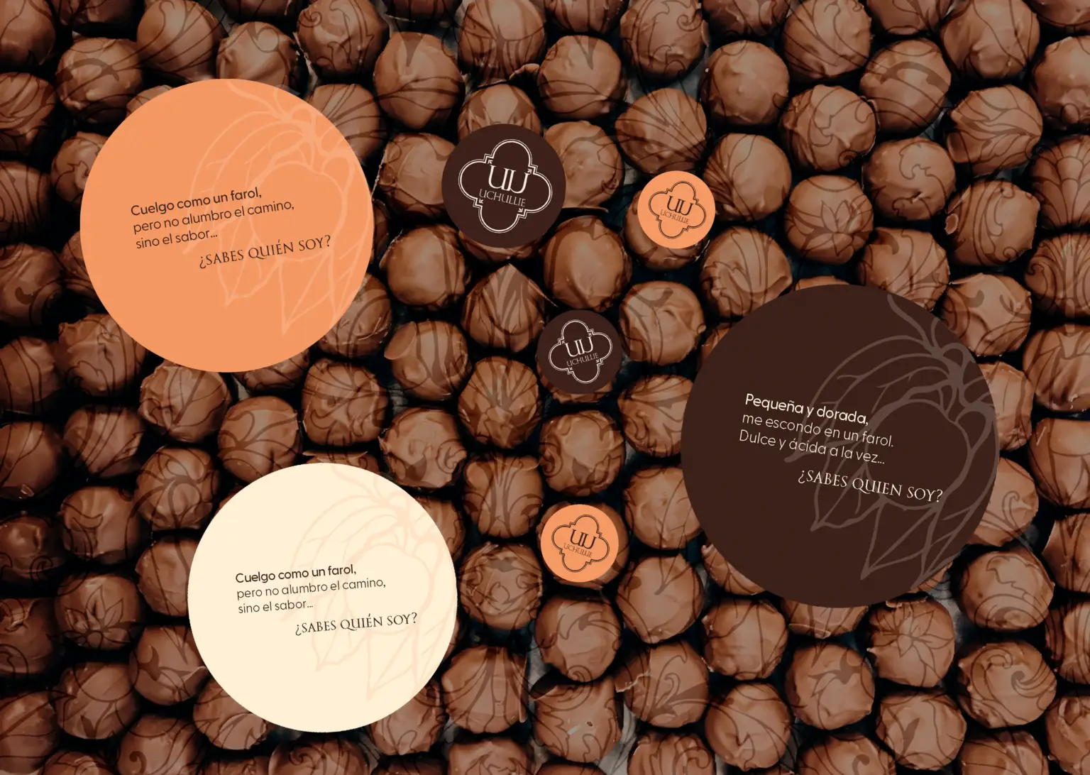
The graphic language draws from the same source, distilled into something quieter. The uchuva's husk, rendered in fine gold linework against warm terracotta, nods to the fruit without ever showing it whole. The palette stays deliberately restrained: copper for warmth, gold for indulgence, cream for clarity. A circular seal closes the composition, echoing the stamped marks found on artisanal chocolate packaging — a small gesture that signals craft without needing to explain itself.
Together, form and graphic don't just wrap a chocolate-covered fruit. They carry a small piece of where it came from.
NOT JUST A WRAPPER — UCHULLIE CARRIES THE STILLNESS OF A LANTERN, THE WARMTH OF ARTISANAL CHOCOLATE, AND THE QUIET LUXURY OF A DETAIL WORTH GIVING.
UCHULLIE
A CHOCOLATE-COVERED UCHUVA SNACK ROOTED IN COLOMBIAN ABUNDANCE AND QUIET INDULGENCE.
Client
Academic Project (Conceptual)
Services
Packaging Design Branding
PROJECT OVERVIEW
This project explores the design of a full packaging system for Uchullie, a premium confectionery brand built around a single native ingredient: the uchuva, wrapped in its own paper-thin husk. The goal was to translate an everyday, unassuming fruit into a cohesive visual identity across individual sleeves and outer packaging, balancing local heritage with a restrained, contemporary packaging language.
The name Uchullie already carried meaning. Built from "uchuva," the name keeps the fruit's identity intact while giving it a softer, more polished cadence — closer to something you'd find on a confectionery shelf than a farmers' market. A small linguistic gesture that mirrors what the packaging does visually: taking something familiar and elevating it without erasing where it comes from.
It was important to honor that origin without falling into the "exotic fruit" cliché. The tone became refined and minimal — rooted in the fruit's own form, not caricature. Visually, the system embraced restrained color, botanical linework, and a typographic hierarchy that let the lantern motif breathe on its own across sleeves while unifying the set as a whole.
FROM SKETCH TO SLEEVE
Every mark on the label began on paper. Hand-drawn studies of pine needles, bamboo stalks, and plum blossoms guided the digital linework that followed—keeping each symbol true to its botanical roots before becoming part of the final system.
INK, COPPER, AND GOLD
The wrapper takes its silhouette from the uchuva's own husk — the small, tapered lantern that already does the work of packaging in nature. That form became the starting point: a slim, foil-lined sleeve that tapers at both ends, echoing the fruit's silhouette without illustrating it literally. A twist-close finish turns the wrapper into a small ritual of its own — closer to unwrapping a gift than opening a snack.
EACH SHADE, A FRAGMENT OF THE FRUIT.
The graphic language draws from the same source, distilled into something quieter. The uchuva's husk, rendered in fine gold linework against warm terracotta, nods to the fruit without ever showing it whole. The palette stays deliberately restrained: copper for warmth, gold for indulgence, cream for clarity. A circular seal closes the composition, echoing the stamped marks found on artisanal chocolate packaging — a small gesture that signals craft without needing to explain itself.
Together, form and graphic don't just wrap a chocolate-covered fruit. They carry a small piece of where it came from.
NOT JUST A WRAPPER — UCHULLIE CARRIES THE STILLNESS OF A LANTERN, THE WARMTH OF ARTISANAL CHOCOLATE, AND THE QUIET LUXURY OF A DETAIL WORTH GIVING.