A SAKE TRIPACK ROOTED IN THE JAPANESE RITUAL OF PINE, BAMBOO, AND PLUM.
Client
Academic Project (Conceptual)
Services
Packaging Design
PROJECT OVERVIEW
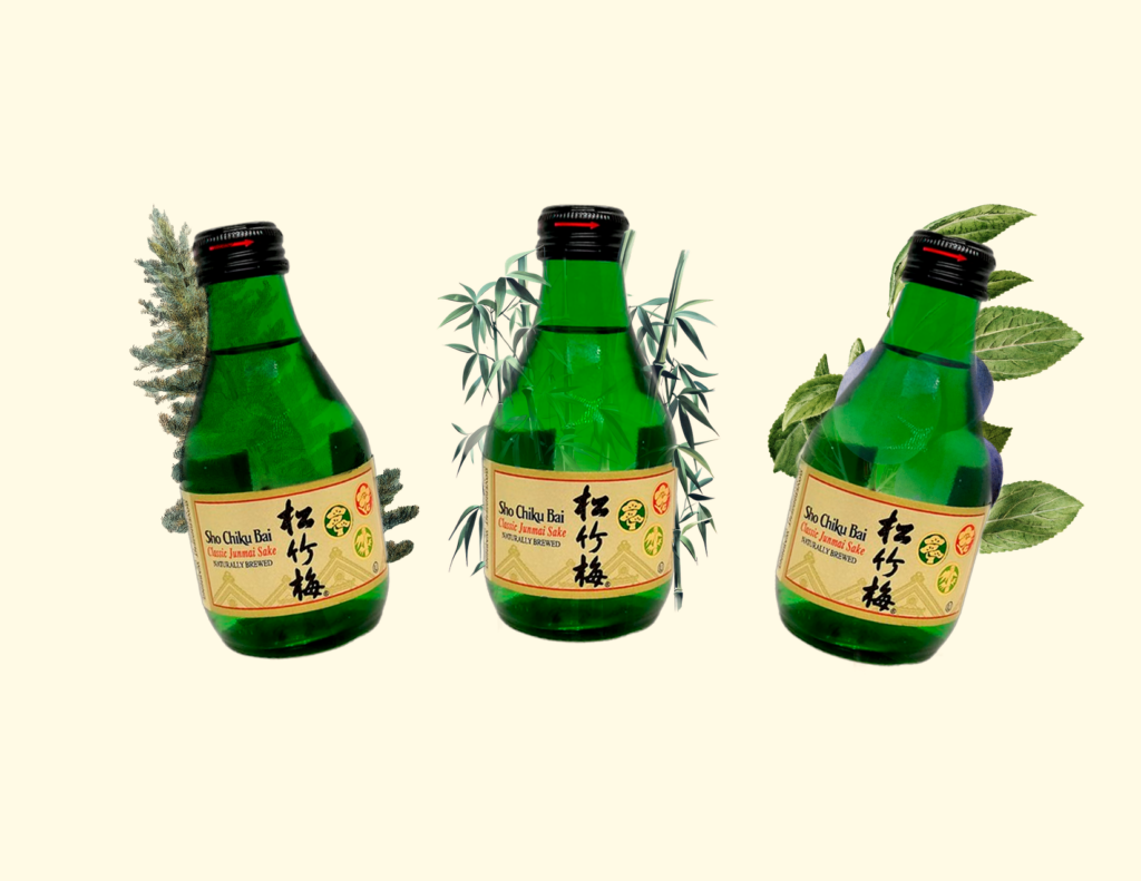
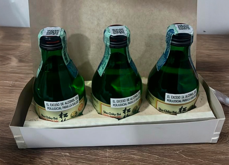
This project explores the design of a tripack packaging system for Sho Chiku Bai sake, inspired by the "Three Friends of Winter"—pine, bamboo, and plum—a symbol of resilience and harmony in Japanese culture. The goal was to translate this ritual into a cohesive visual identity across three bottles, balancing tradition with a contemporary packaging language.
The name Sho Chiku Bai (松竹梅) already carried meaning. Pine, bamboo, and plum—three plants that endure winter's harshest months, each symbolizing strength, flexibility, and renewal. A tribute to perseverance and quiet elegance, values deeply woven into Japanese ceremony and everyday ritual.
It was important to honor that meaning without falling into cliché. The tone became refined and minimal—rooted in tradition, not caricature. Visually, the tripack embraced restrained color, natural textures, and a typographic hierarchy that let each symbol breathe on its own bottle while unifying the set as a whole.
FROM SKETCH TO BOTTLE
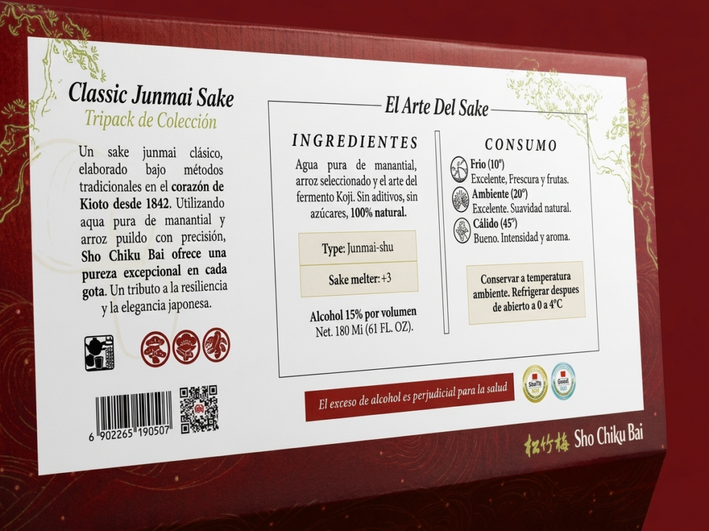
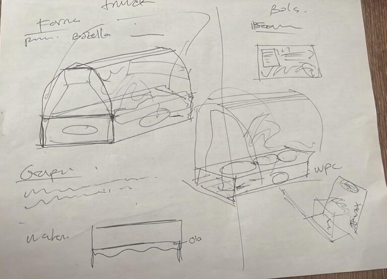
Every mark on the label began on paper. Hand-drawn studies of pine needles, bamboo stalks, and plum blossoms guided the digital linework that followed—keeping each symbol true to its botanical roots before becoming part of the final system.
INK, PINE, AND GOLD
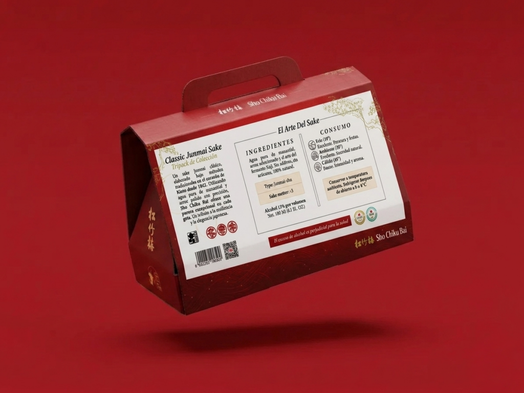
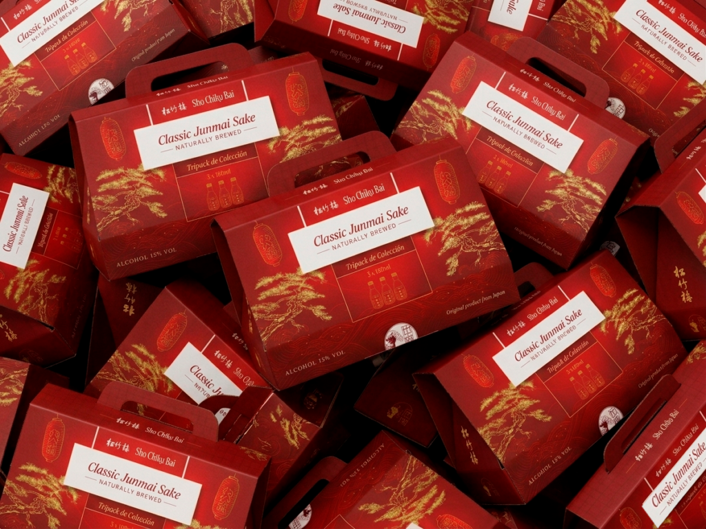
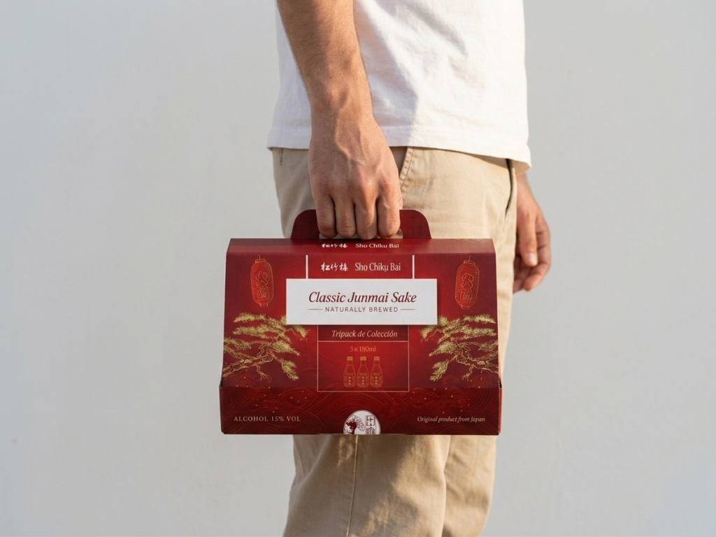
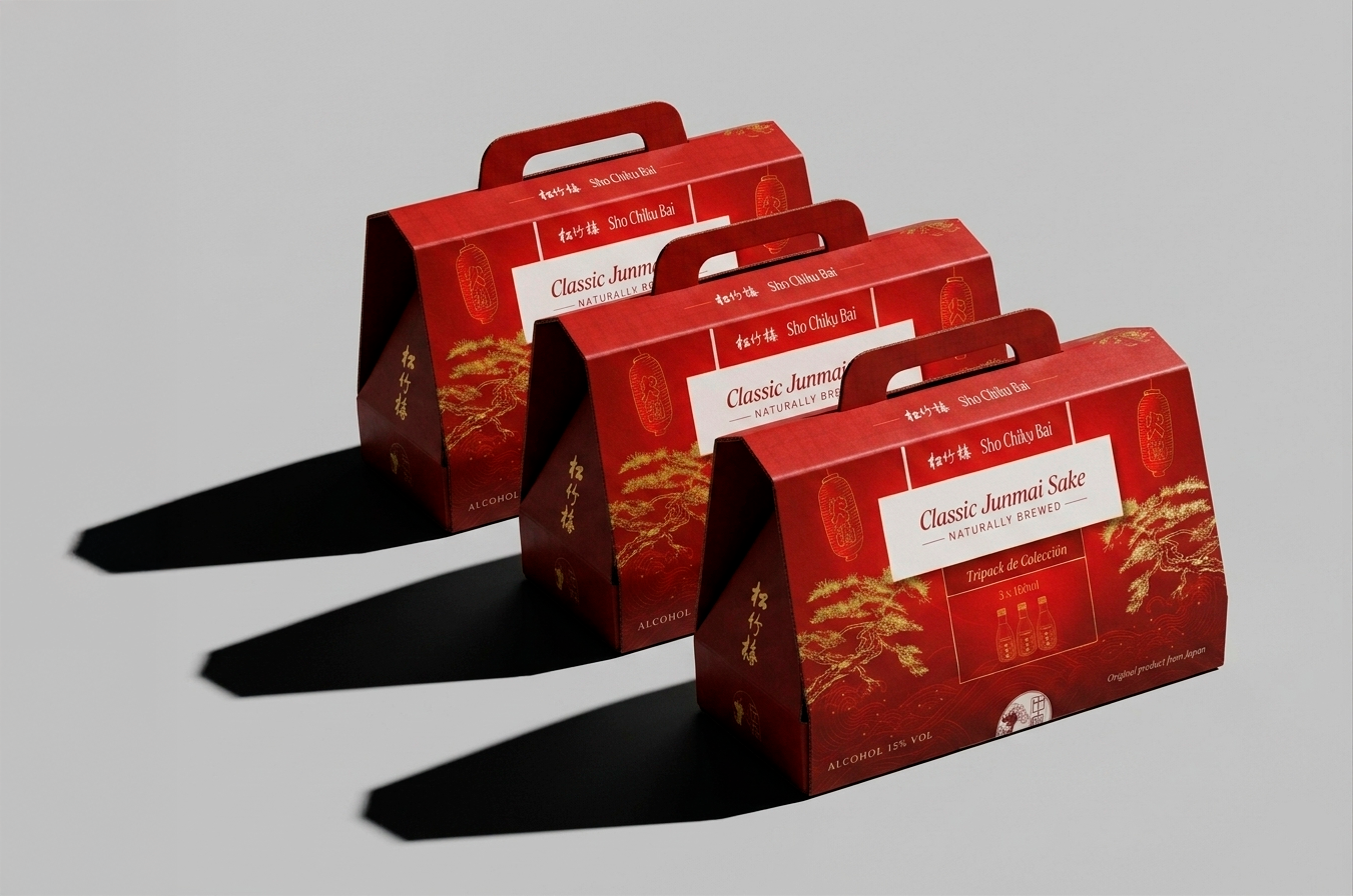
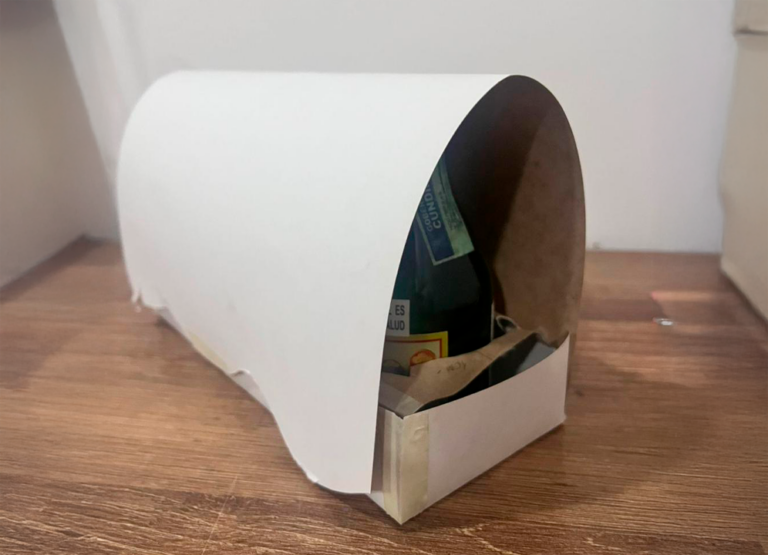
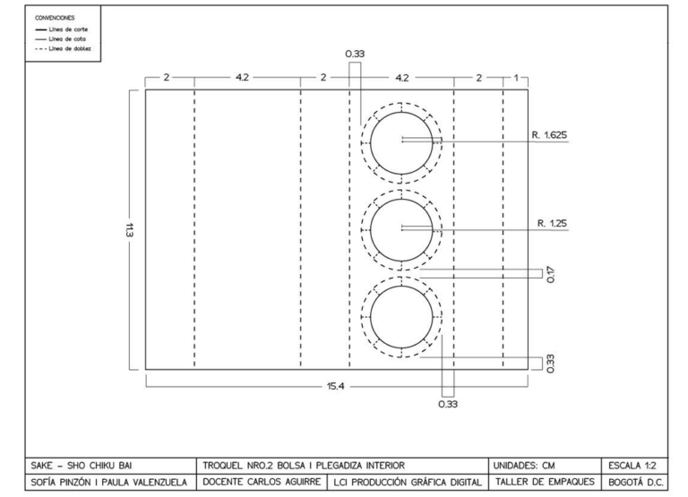
The tripack takes its silhouette from a yatai—the traditional Japanese street stalls where food and drink are served beneath a tilted roof. That inclined form became the starting point: an angular, envelope-like structure that folds around the three bottles, stable enough to stack and simple enough to read at a glance. A built-in handle turns the package into something meant to be carried, not just displayed—closer to a gift than a shelf item.
EACH SHADE, A FRAGMENT OF THE STORY.
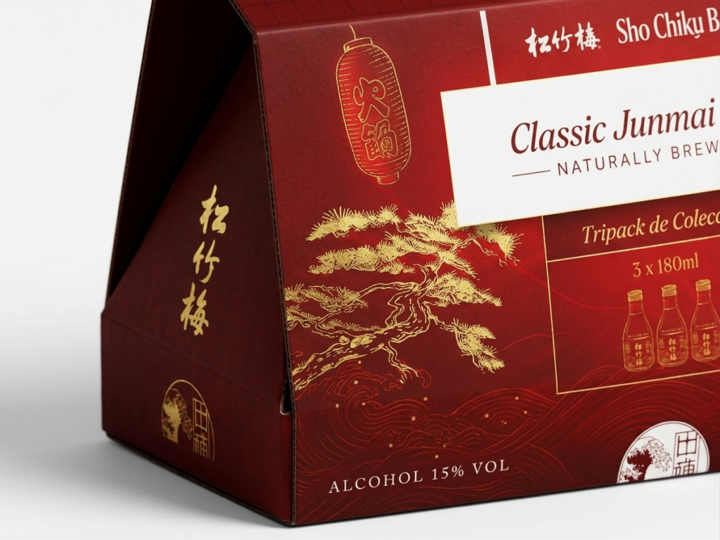
The graphic language draws from the same source, distilled into something quieter. A bonsai pine, rendered in gold linework against deep red, nods to Sho—the first of the "Three Friends of Winter." The palette stays deliberately restrained: red for ceremony, gold for the warmth of aged sake, white for clarity. A circular seal closes the composition, echoing the stamped marks found on traditional Japanese packaging—a small gesture that signals authenticity without needing to explain itself.
Together, form and graphic don't just package three bottles of sake. They carry a fragment of ritual with them.
NOT JUST A TRIPACK—SHO CHIKU BAI CARRIES THE STILLNESS OF A YATAI, THE WEIGHT OF TRADITION, AND THE PATIENCE OF WINTER'S THREE FRIENDS.
This is a conceptual, non-commercial academic project created for portfolio and educational purposes only. Sho Chiku Bai is an existing sake brand; no affiliation, endorsement, or commercial use is intended.
SHO CHIKU BAI
A SAKE TRIPACK ROOTED IN THE JAPANESE RITUAL OF PINE, BAMBOO, AND PLUM.
Client
Academic Project (Conceptual)
Services
Packaging Design
PROJECT OVERVIEW
This project explores the design of a tripack packaging system for Sho Chiku Bai sake, inspired by the "Three Friends of Winter"—pine, bamboo, and plum—a symbol of resilience and harmony in Japanese culture. The goal was to translate this ritual into a cohesive visual identity across three bottles, balancing tradition with a contemporary packaging language.
The name Sho Chiku Bai (松竹梅) already carried meaning. Pine, bamboo, and plum—three plants that endure winter's harshest months, each symbolizing strength, flexibility, and renewal. A tribute to perseverance and quiet elegance, values deeply woven into Japanese ceremony and everyday ritual.
It was important to honor that meaning without falling into cliché. The tone became refined and minimal—rooted in tradition, not caricature. Visually, the tripack embraced restrained color, natural textures, and a typographic hierarchy that let each symbol breathe on its own bottle while unifying the set as a whole.
FROM SKETCH TO BOTTLE
Every mark on the label began on paper. Hand-drawn studies of pine needles, bamboo stalks, and plum blossoms guided the digital linework that followed—keeping each symbol true to its botanical roots before becoming part of the final system.
INK, PINE, AND GOLD
The tripack takes its silhouette from a yatai—the traditional Japanese street stalls where food and drink are served beneath a tilted roof. That inclined form became the starting point: an angular, envelope-like structure that folds around the three bottles, stable enough to stack and simple enough to read at a glance. A built-in handle turns the package into something meant to be carried, not just displayed—closer to a gift than a shelf item.
EACH SHADE, A FRAGMENT OF THE STORY.
The graphic language draws from the same source, distilled into something quieter. A bonsai pine, rendered in gold linework against deep red, nods to Sho—the first of the "Three Friends of Winter." The palette stays deliberately restrained: red for ceremony, gold for the warmth of aged sake, white for clarity. A circular seal closes the composition, echoing the stamped marks found on traditional Japanese packaging—a small gesture that signals authenticity without needing to explain itself.
Together, form and graphic don't just package three bottles of sake. They carry a fragment of ritual with them.
NOT JUST A TRIPACK—SHO CHIKU BAI CARRIES THE STILLNESS OF A YATAI, THE WEIGHT OF TRADITION, AND THE PATIENCE OF WINTER'S THREE FRIENDS.
This is a conceptual, non-commercial academic project created for portfolio and educational purposes only. Sho Chiku Bai is an existing sake brand; no affiliation, endorsement, or commercial use is intended.