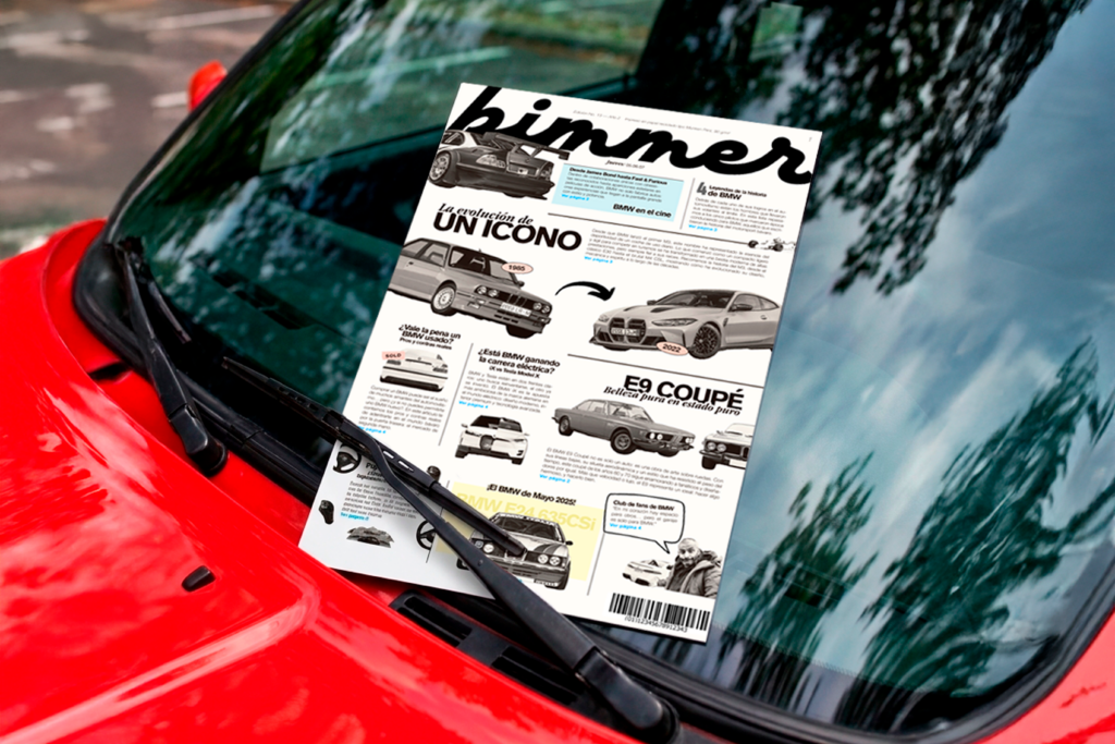
BIMMER
A PUBLICATION BUILT AROUND BMW CAR CULTURE, BALANCING MOTORSPORT HERITAGE WITH FAN OBSESSION.
Client
Self-Initiated Project
Services
Editorial Design
ARTIFACTS
THE CULTURAL FRAGMENTS, REFERENCES, AND RESEARCH THAT SHAPE THE SOUL OF THIS WORLD.
EYE'S BMW Z3
The moment a car became a character. Bond didn't just drive it — he made it desirable.
THE KIDNEY GRILLE
Not a detail. A signature. Evolved, never abandoned.
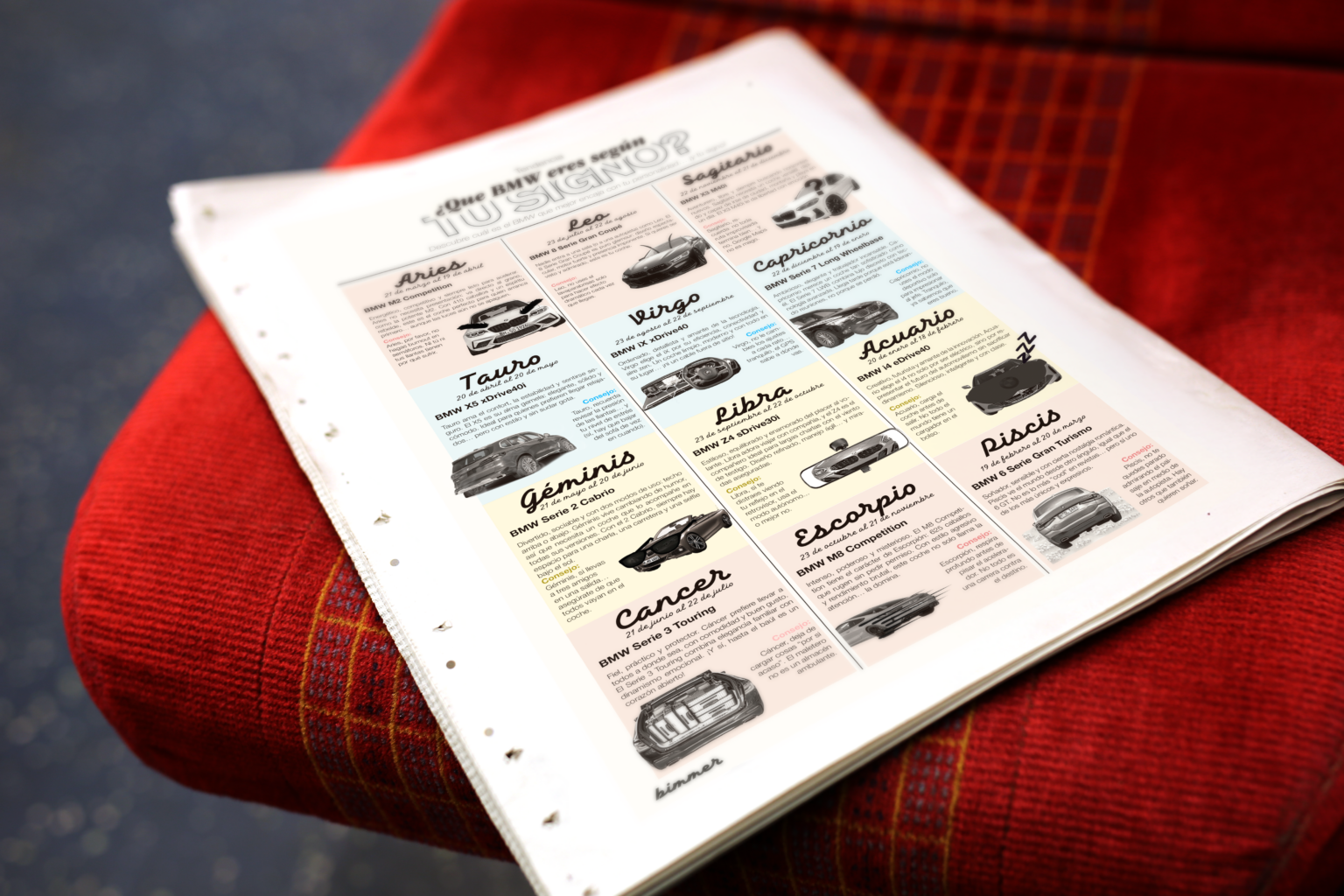
THE ZODIAC HOROSCOPE
Proof that obsession doesn't have to be serious to be sincere. The tabloid's voice, distilled into twelve punchlines.
What if a fan publication treated car parts the way art history treats relics — worth studying, worth romanticizing?
Motorsport history, film cameos, and model lore don't just decorate bimmer — they're the source material. Every spread pulls from a shared visual memory bank: race liveries, Bond-era product placement, decades of grille redesigns. The tabloid format exists to hold all of it together without flattening it into a spec sheet.
DESIGN DECISIONS
ENDURING PERSONAS THAT GUIDE THE PUBLICATION'S TONE AND VOICE.
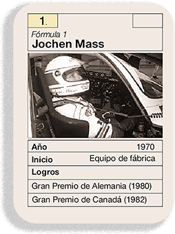
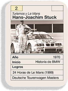
Bimmer sits between the outlaw and the ruler — irreverence and reverence in equal parts. That tension is the whole voice: serious enough to trace the M3's 30-year lineage, loose enough to run a zodiac horoscope matching star signs to BMW models.
WHAT IF A CAR MAGAZINE READ LIKE A LOVE LETTER, NOT A SPEC SHEET?
Car culture carries its own mythology. To cover a brand with real motorsport pedigree without turning it into an ad. To be technical without losing warmth. To make room for humor without losing credibility. Here, the work isn't just reporting on cars — it's translating obsession into print.

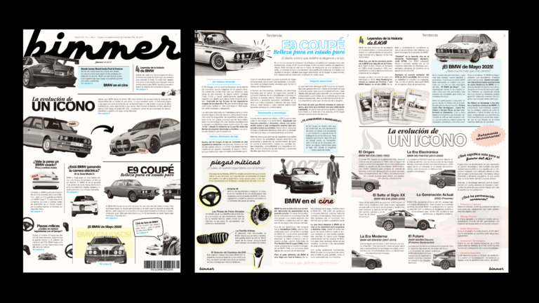
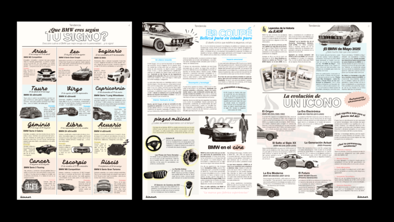

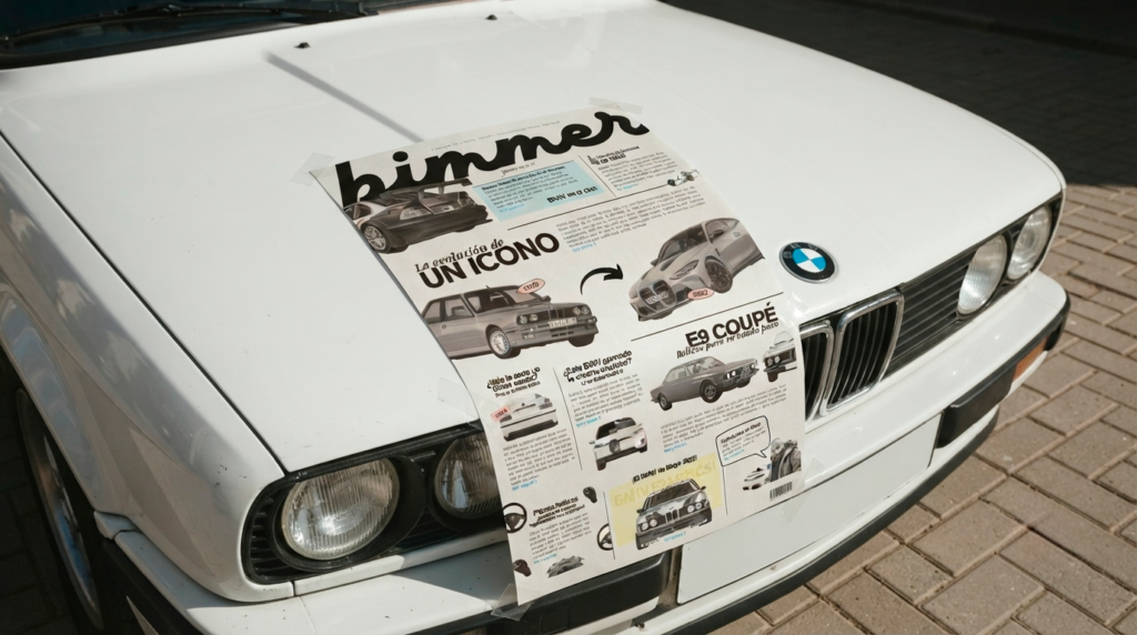
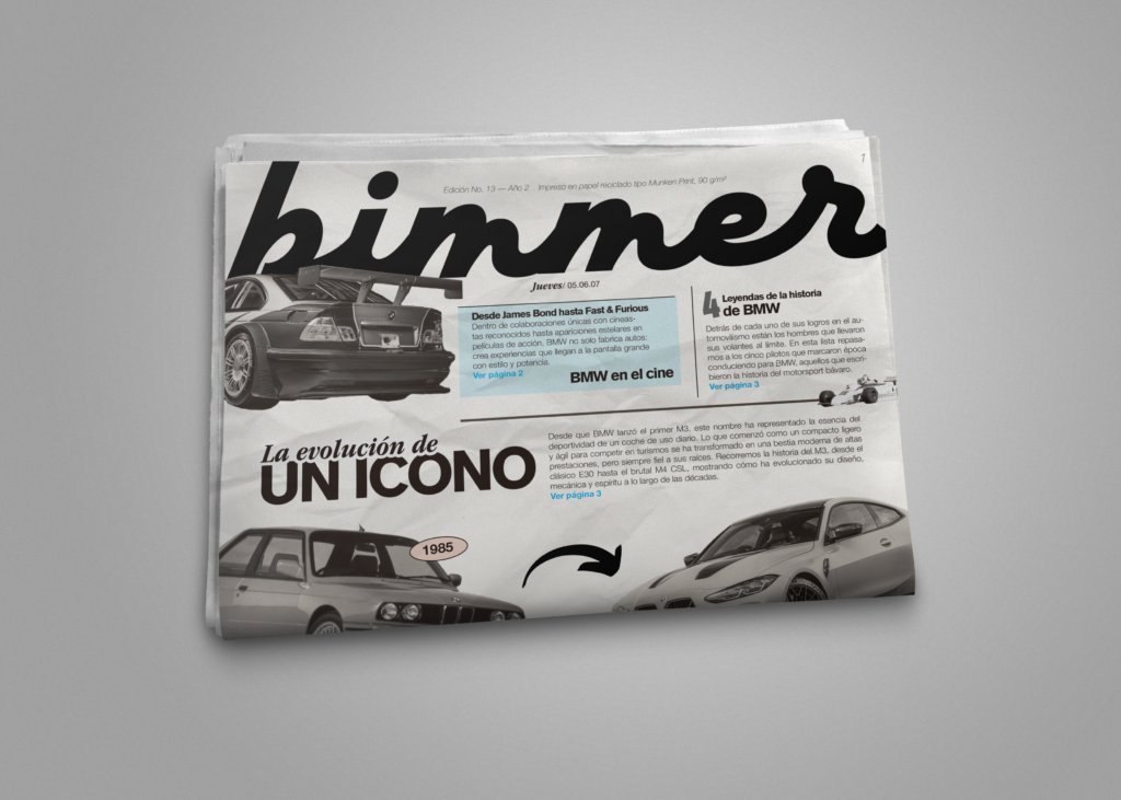
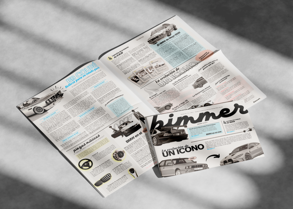
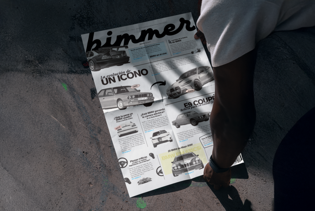
Color stayed black-and-white, letting photography and rare accent tones (a pale cover-blue, a warm horoscope cream) carry all the hierarchy. Typography splits in two: serif italics for feature headlines borrowed from classic newspaper mastheads, clean sans-serif for dense body copy. Small print details — recycled paper stock, issue number, barcode — sell the illusion of a real, physical run.
A visual system built on restraint, tuned for a subject that's anything but restrained.
bimmer is a fictional editorial project created for academic purposes as part of MadByFive's design portfolio. It is not an official BMW publication, is not affiliated with or endorsed by BMW AG, and no profit is derived from its content, imagery, or distribution.
BIMMER
A PUBLICATION BUILT AROUND BMW CAR CULTURE, BALANCING MOTORSPORT HERITAGE WITH FAN OBSESSION.
Client
Self-Initiated Project
Services
Editorial Design
ARTIFACTS
THE CULTURAL FRAGMENTS, REFERENCES, AND RESEARCH THAT SHAPE THE SOUL OF THIS WORLD.
EYE'S BMW Z3
The moment a car became a character. Bond didn't just drive it — he made it desirable.
THE KIDNEY GRILLE
Not a detail. A signature. Evolved, never abandoned.
THE ZODIAC HOROSCOPE
Proof that obsession doesn't have to be serious to be sincere. The tabloid's voice, distilled into twelve punchlines.
What if a fan publication treated car parts the way art history treats relics — worth studying, worth romanticizing?
Motorsport history, film cameos, and model lore don't just decorate bimmer — they're the source material. Every spread pulls from a shared visual memory bank: race liveries, Bond-era product placement, decades of grille redesigns. The tabloid format exists to hold all of it together without flattening it into a spec sheet.
DESIGN DECISIONS
ENDURING PERSONAS THAT GUIDE THE PUBLICATION'S TONE AND VOICE.
Bimmer sits between the outlaw and the ruler — irreverence and reverence in equal parts. That tension is the whole voice: serious enough to trace the M3's 30-year lineage, loose enough to run a zodiac horoscope matching star signs to BMW models.
WHAT IF A CAR MAGAZINE READ LIKE A LOVE LETTER, NOT A SPEC SHEET?
Car culture carries its own mythology. To cover a brand with real motorsport pedigree without turning it into an ad. To be technical without losing warmth. To make room for humor without losing credibility. Here, the work isn't just reporting on cars — it's translating obsession into print.
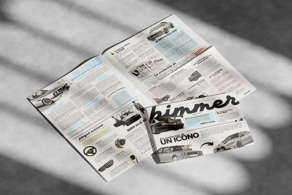
Color stayed black-and-white, letting photography and rare accent tones (a pale cover-blue, a warm horoscope cream) carry all the hierarchy. Typography splits in two: serif italics for feature headlines borrowed from classic newspaper mastheads, clean sans-serif for dense body copy. Small print details — recycled paper stock, issue number, barcode — sell the illusion of a real, physical run.
A visual system built on restraint, tuned for a subject that's anything but restrained.